Marvel Unveils New Logo at New York Comic Con, Generating Mixed Fan Reactions
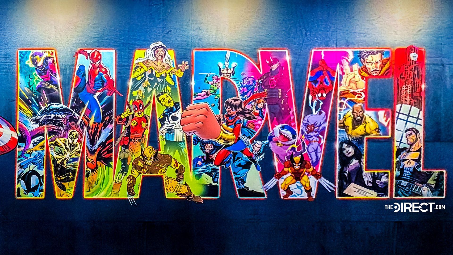
At this year’s New York Comic Con, Marvel unveiled a vibrant new logo that has ignited a flurry of reactions among fans. The updated design features a multitude of character cameos, capturing the essence of both beloved icons and new entries within the Marvel universe. However, the response is far from unanimous, with opinions ranging from excitement to disappointment over the logo’s complexity and omissions.
A Colorful Tribute to Iconic Characters
The redesigned Marvel logo offers a dynamic take on the classic wordmark, showcasing beloved characters like Spider-Man and Wolverine, who each make multiple appearances. Yet, notable absences like Thor and Captain America have sparked conversations about what this might mean for Marvel’s future branding. The presence of quirky characters, such as Jeff the Land Shark, has provided some levity amidst the criticism.
Fan Reactions: Praise and Criticism
While numerous fans have lauded the design for its ambitious character inclusivity, others view it as visually overwhelming. Comments across social media reflect this divide, with one supporter stating, “While I appreciate the effort to be vibrant, this new logo just feels too busy and visually overwhelming.” Another fan echoed this sentiment, expressing feelings of overstimulation from the intricate design.
- Key Highlights:
- New logo launched at New York Comic Con.
- Features multiple character cameos.
- Mixed responses regarding visual complexity.
- Some iconic characters notably absent.
Looking Ahead
Given the mixed reviews, it’s plausible that Marvel could iterate on this design, especially considering they just updated their previous logo last year. As Marvel continues to evolve, it will be interesting to see how they balance creative ambition with fan expectations. For further insights and quizzes about superhero branding, stay tuned.


