The Evolution and Significance of the TikTok Logo
The TikTok logo might appear simple at first glance, but its design is both clever and impactful, making it instantly recognizable in the crowded social media landscape. Created in 2016, the logo was originally developed for Douyin, the Chinese counterpart of TikTok, and has undergone only minor adjustments since then. This unique branding includes an audio element known as the TikTok sonic logo, which enhances user engagement.
A Brief History of the TikTok Logo
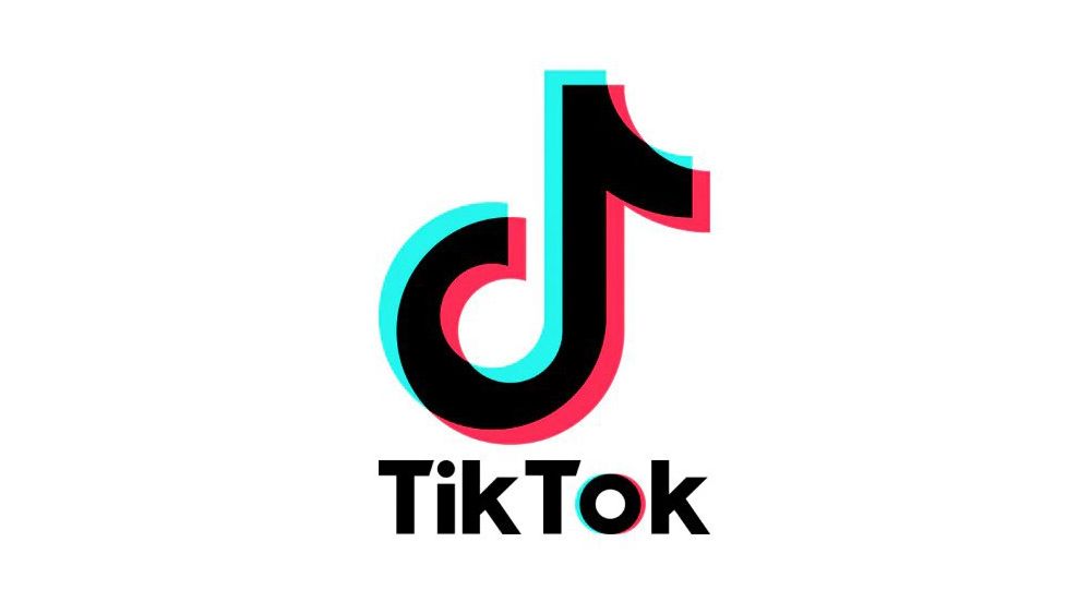
Initially launched as A.me in September 2016, the app was soon renamed Douyin, meaning “shaking sound.” The original logo design incorporated a musical note, signifying the platform’s emphasis on music. As the app evolved, the logo was adapted to include fuchsia and cyan shadows, simulating motion to reflect the evolving brand identity.
In 2017, after acquiring Musical.ly—a popular platform that allowed users to create lip-sync videos—ByteDance rebranded and launched TikTok globally. While the Musical.ly logo featured a design resembling sound waves, ByteDance opted to start fresh with a distinctive branding strategy that featured the musical note symbol as a universal representation of creativity.
TikTok’s Iconic Design Elements
The current TikTok logo is characterized by a bold black background with cyan and fuchsia accents, reflecting a modern, youthful energy. The original logo’s text was updated to form a more cohesive visual identity, incorporating a heavier type that enhances connection to the graphic symbol. This thoughtful design not only distinguishes TikTok from other social media platforms but also encapsulates the app’s core mission—a stage for creativity that inspires joy among its users.
The Sonic Component
TikTok’s sonic branding further enriches its identity, having won numerous awards, including distinctions at the Red Dot Awards 2023. Designed to echo the platform’s community-driven ethos, the sound integrates user-generated content, creating a powerful audio identity that resonates with almost 84% of its audience.
Why the TikTok Logo Stands Out
Despite many users being unaware of its origin related to Douyin, the TikTok logo has effectively captured the platform’s essence. The logo adheres to classic design principles with contrasting colors and simple, memorable shapes that reflect TikTok’s vibrant and rebellious spirit. The effective use of color theory contributes to a three-dimensional appearance, setting TikTok apart from other social media logos while embodying the app’s engaging energy.
For those interested in logo design trends or seeking inspiration, TikTok’s branding strategy serves as a compelling case study for understanding the intersection of design, culture, and community engagement in the digital age.


