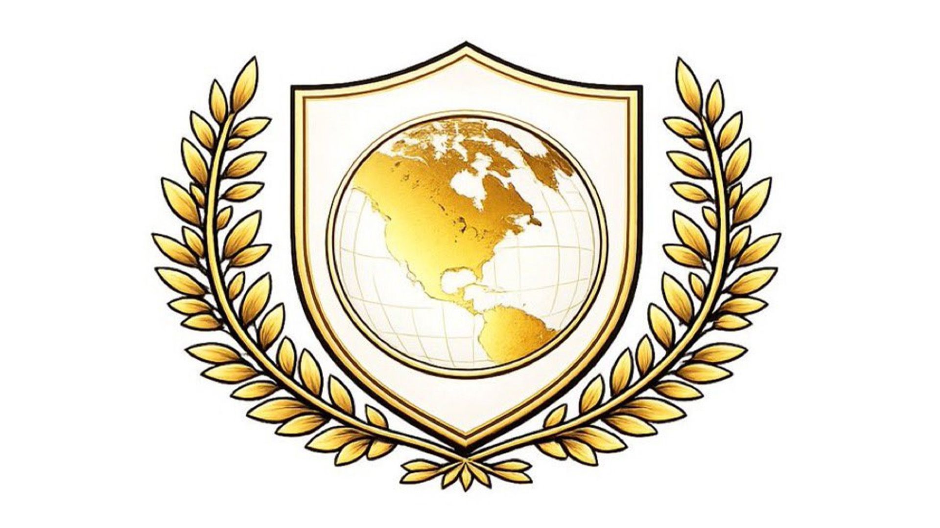
To celebrate the launch of his “Board of Peace,” former President Donald Trump has unveiled a new logo that has quickly become the subject of scrutiny. Critics have expressed their concerns over its design quality, suggesting it may have been generated by artificial intelligence due to its lack of professionalism and clarity.
The logo features a shield, map, and olive branch, all adorned in Trump’s signature gold tone. At first glance, it appears harmless, but a closer look reveals significant design flaws. Users on social media wasted no time disparaging the imagery, noting its “clip-art wreath” paired with a “pseudo-realistic, geo-textured map” as a major misstep. One social media user remarked, “This design screams Microsoft Paint,” while another stated it was “beyond parody.”
A particularly striking aspect of the logo is the overtly America-centric depiction of the world map, which prominently features North America. This peculiar design choice led many to raise eyebrows, with speculation that an AI might have played a role in its creation. Comments such as “There’s no way this logo was made by a graphic designer” paint a clear picture of disapproval among observers.
This isn’t the first instance where Trump’s graphic choices have raised eyebrows; his previous White House logo also drew mixed reactions for its heavy-handed symbolism. While the new Board of Peace logo embodies Trump’s brand—characterized by boldness and a touch of divisiveness—its design has sparked a debate about the importance of professional graphic design in political branding.
Key Points:
– Launch of Trump’s “Board of Peace” logo has attracted criticism.
– Social media users suggest AI influence due to design flaws.
– Elements include a map and olive branch in Trump’s signature gold.
– Past design choices have also faced scrutiny, indicating a pattern.

