Timeless Logos: Insights from Iconic Brands
Many designers face the challenging scenario when a new marketing director demands changes to carefully crafted brand guidelines. Surprisingly, leading brands have achieved their success by maintaining the integrity of their logos for years, even centuries. This principle emphasizes that a standout logo should not follow fleeting trends; instead, it should stand the test of time.
In this exploration, we analyze eight logos that exemplify longevity and what lessons they offer for enduring design.
Key Insights from Timeless Logos
-
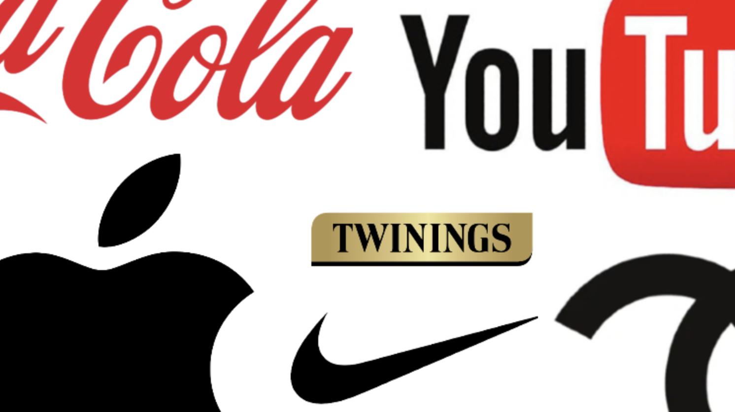
Twinings Wordmark: Known as one of the oldest unchanged commercial logos, Twinings has preserved its design since 1787. Its classic serif capital letters evoke British heritage and authenticity, demonstrating that strong brand identity does not require alteration.
-
Coca-Cola Script: Introduced by Frank Mason Robinson in the late 19th century, this logo transcends mere lettering to embody nostalgia and warmth. Its emotional resonance became evident when the brand eliminated its name from bottles during marketing campaigns, showcasing the logo’s intrinsic familiarity.
-
Levi’s Red Tab: Since its introduction in 1936, the Levi’s logo exemplifies durability and ruggedness, aligning with the brand’s values. This coherence between product and branding teaches designers that authenticity is more lasting than chasing current trends.
-
Nike Swoosh: The Swoosh is a masterclass in abstraction, representing movement without depicting a specific object. Its minimalist design allows it to remain relevant, enabling Nike to confidently phase out its wordmark while still being instantly recognizable.
-
Apple Silhouette: Originally a detailed engraving of Isaac Newton, Apple’s logo has evolved in texture while preserving its iconic shape since 1977. This evolutionary approach reflects modernity without compromising brand recognition.
-
YouTube Logo: Launched in 2005, YouTube’s design—incorporating a play button within a rounded rectangle—has become synonymous with online video. The significance of its original elements underscores the importance of protecting visual identity as it becomes integral to culture.
-
Chanel Monogram: Created by Coco Chanel in 1925, the double-C monogram has never changed. This unwavering consistency reinforces Chanel’s status as a luxury brand, illustrating that in the fashion world, stability communicates power.
-
IBM Logo: Designed by Paul Rand in 1972, the eight-bar logo not only addressed printing challenges but also projected speed and efficiency, establishing it as a corporate identity pillar.
These eight logos, spanning various industries and decades, share a fundamental quality: the confidence to cease redesigning. A successful logo is a repository of experiences and emotions tied to the brand. The longer it remains unchanged, the deeper its significance becomes.
As designers assess requests for modernization, they should reflect on these successful examples. Timeless logos illustrate that the power of a design lies in its ability to endure, retaining relevance far beyond temporary trends.