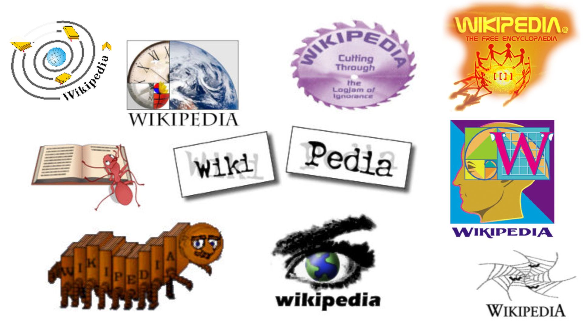
Wikipedia, the widely recognized online encyclopedia, is celebrating its 25th anniversary by revisiting a collection of alternative logos that were never adopted. This retrospective offers a fascinating glimpse into the past, showcasing the diverse design proposals that reflect the quirky creativity of the early internet era. In contrast to today’s minimalist trends, the rejected logos burst with vibrant colors and eclectic styles, embodying the spirit of community-driven design that has always been central to Wikipedia’s identity.
In a recent blog entry, the Wikimedia Foundation emphasized how community consensus has shaped not just the content but also the visual identity of the platform. Each logo proposal, from amateur creators to professional designers, was thoughtfully evaluated for its potential contribution to the brand. Among the eclectic submissions, noteworthy designs included a colorful hydra, an ant engrossed in reading an encyclopedia, and an imaginative centipede made of books known as the “Wikipede.” Ultimately, the beloved puzzle globe was chosen for its simplicity and profound symbolism, selected after extensive community deliberation.
The celebration also highlights the introduction of a playful new mascot, dubbed the “Baby Globe,” further enriching Wikipedia’s visual storytelling as it looks to the future. The retrospective serves as a reminder of how much design has evolved while celebrating the creativity that continues to define the platform.

