PepsiCo Introduces First Logo Update in 25 Years, but Reception Falls Flat
In a significant move, PepsiCo has unveiled its first rebranding in a quarter-century, shifting from a capitalized logo featuring a globe to a fresh design that emphasizes lowercase letters and the letter ‘P.’ However, initial reactions indicate that many consumers are not impressed with this transformation.
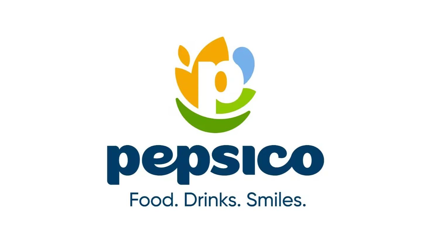
The new logo sees the ‘P’ encircled by shapes symbolizing various aspects of the company’s mission. For instance, a grain-inspired form highlights PepsiCo’s agricultural roots, a blue shape represents hydration and refreshment, and a green leaf icon signifies their commitment to sustainability and positive impact under the concept of “winning with pep+.” A darker green smile underscores a focus on consumer satisfaction, while the accompanying tagline boasts, “Food. Drinks. Smiles.”
Critics argue that the rebranding may seem overly complicated, suggesting that the logo’s intricate symbolism necessitates extensive explanation. While the intention was to diversify recognition beyond the Pepsi brand—only 21% of consumers can name another PepsiCo brand—many feel that the new design lacks flair and vibrancy. PepsiCo describes its color palette as inspired by “rich soils” and “vibrant hues,” but many find the overall impact underwhelming.
The rollout of the new branding will extend across PepsiCo’s digital platforms, including LinkedIn, Instagram, TikTok, and YouTube, as well as the company’s website. This gradual introduction aims to refresh PepsiCo’s image as it seeks broader recognition apart from its flagship product.
As PepsiCo embarks on this branding journey, industry watchers are left to ponder whether this new identity will resonate with consumers or fade into obscurity—ultimately questioning if the company has truly accomplished its objective of revitalizing its corporate presence.