Emerald Fennell’s adaptation of “Wuthering Heights” has stirred considerable debate since its trailer debuted, accompanied by an energetic score from Charli XCX and a strikingly Instagram-ready cast. Departing from traditional interpretations, this film’s approach prioritizes aesthetics over literary accuracy, which has sparked mixed opinions among audiences. The release of the new poster further underscores this divide.
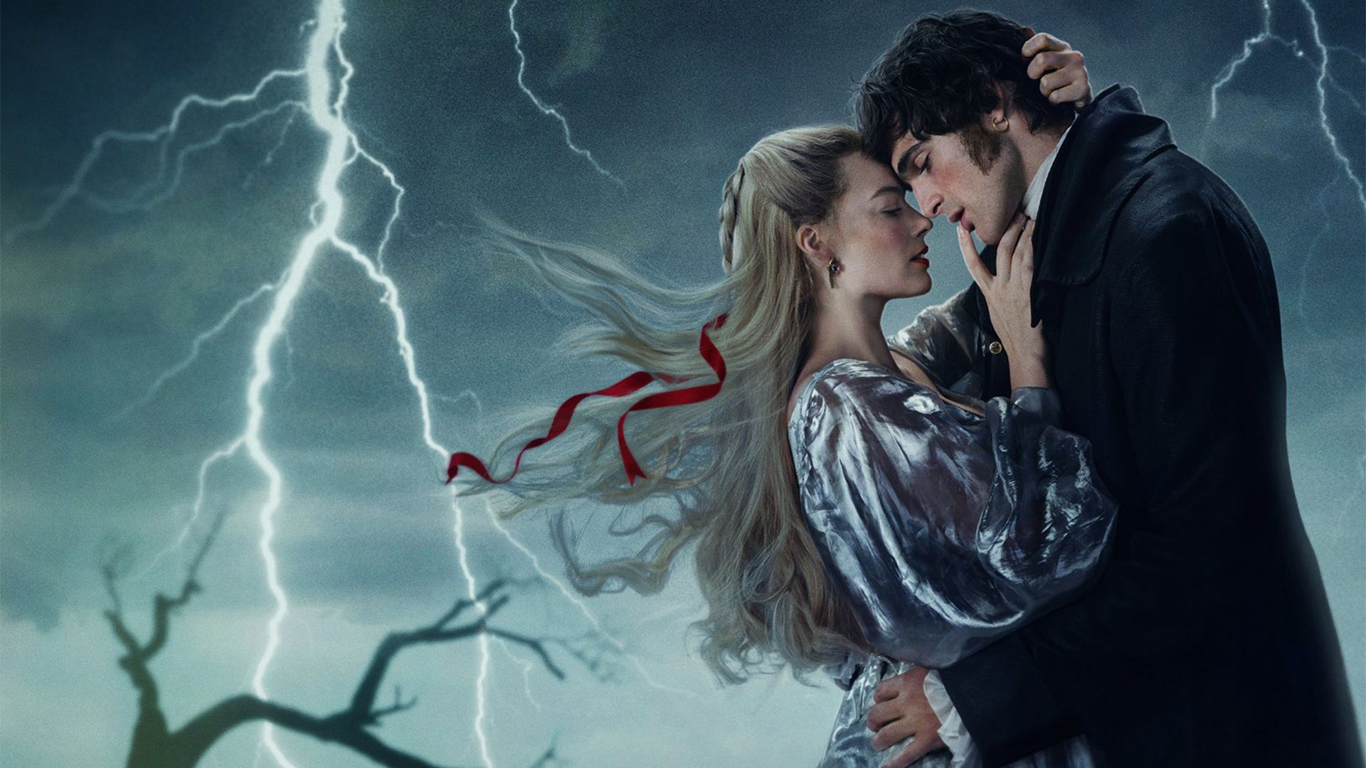
Visually intriguing, the poster presents a playful take on the classic narrative—though opinions on its artistic merit vary widely. The design, infused with a tongue-in-cheek sensibility, adds an engaging layer to the promotion of the film. Featuring a dramatic stormy backdrop that amplifies its emotional intensity, the monochromatic color scheme is contrasted by vibrant red typography and the flowing ribbon of Cathy’s hair. This bold aesthetic can be likened to a romantic novel found in a discount bin—a choice that resonates with some while leaving others unimpressed.
Critics have voiced their concerns, with comments ranging from, “Why does this poster look like it was designed by a 15-year-old for their Wattpad stories?” to claims that “Emily Brontë is turning in her grave.” Despite the backlash, Fennell’s design reflects a contemporary, campy interpretation that embraces a self-aware theatricality.
This latest visual representation aligns with the directorial style showcased in the trailer, indicating that the adaptation does not aim to cater to “Wuthering Heights” purists. Instead, it opts for a bold reinterpretation that challenges traditional norms and encourages a fresh conversation about this literary classic. Whether you admire its charm or critique its execution, the poster undeniably encapsulates the film’s provocative identity in modern cinema.

