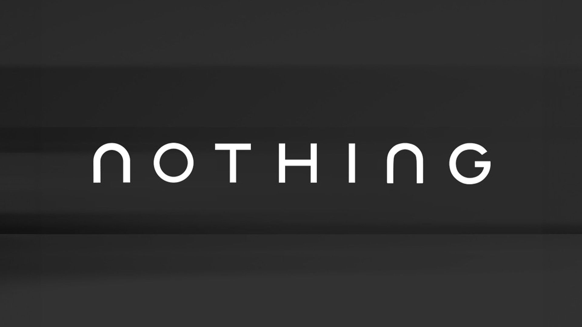
Tech company Nothing has recently stirred discussion among its fanbase with the introduction of a new logo—a streamlined wordmark that aligns with the current trend towards minimalist design. This move mirrors a broader industry shift that has sparked debate, particularly seen with the rebranding efforts of notable brands such as Cracker Barrel and Jaguar. While simplistic logos often carry an aesthetic appeal, they can tread the fine line between elegance and blandness.
The teaser, accompanied by the phrase “getting ready to make history,” showcases clean sans-serif lettering with smooth contours, drawing striking comparisons to the contentious Jaguar rebranding. This resemblance has not gone unnoticed by observers and fans alike.
Reactions to the logo have varied widely. Some fans have expressed excitement, with one commenter noting, “Love the new logo,” while another optimistically stated, “Finally changing that terrible logo, congrats!” Conversely, critiques have emerged as well, with detractors labeling the design as reminiscent of Jaguar’s controversial approach. Concerns have been raised about the potential loss of the original brand’s unique character, with one distressed fan remarking, “It’s giving Jaguar rebrand,” and another lamenting, “I love the pixel-ish design. Why is the new logo so… soulless?”
As Nothing continues to navigate its branding identity, the varied responses illustrate the significant emotional connection fans have with logo designs. This discourse highlights that any potential rebranding must carefully consider the preservation of the brand’s distinct personality to ensure long-term loyalty among its supporters.


