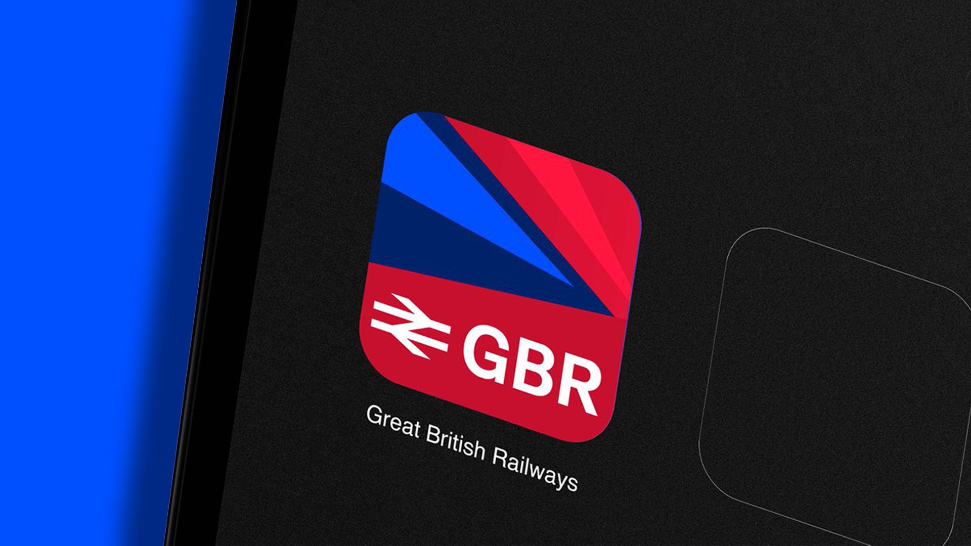
The UK Government has unveiled a new logo for Great British Railways (GBR), marking a significant step in the transition towards a nationalized rail system, reviving the legacy of British Rail, which was privatized in 1997. This updated design, blending nostalgia with modern aesthetics, aims to symbolize progress and forward momentum in the UK rail network. However, it has sparked a notable debate among the public.
Key features of the new GBR logo include the iconic double arrow emblem from the original British Rail, reimagined within a contemporary framework. The design adheres to a bold color scheme inspired by the Union Flag, featuring red, white, and blue tones, which some critics argue leans too heavily into nationalism without creating a distinctive identity.
Despite the intent behind the minimalist design, public reception has been mixed. Some users on social media platforms, like Reddit, have expressed strong dissatisfaction, describing the logo as “inelegant” and too reminiscent of American design sensibilities. One commenter criticized the overwhelming use of flag elements, suggesting it undermines the strength of the brand’s identity. Another opinion pointed to the enduring legacy of past designs, arguing that the new logo lacks the boldness seen in previous iterations.
With opinions varied across the spectrum, this rebranding effort is a testament to the complexities of modern identity in public transport. Observers are left questioning whether the new logo will resonate with the public in the long term or fade into obscurity like many transient designs.


