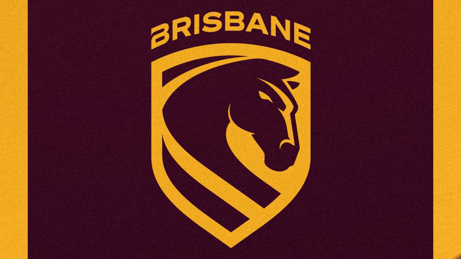
The Brisbane Broncos have launched a striking new logo, marking their first significant redesign in over two decades. This rebranding effort aims to refresh the team’s visual identity, an endeavor that often elicits a wide range of reactions from devoted fans. While many enthusiats are optimistic about this bold new look, reactions have been mixed, highlighting the challenges of satisfying long-time supporters of a beloved sports franchise.
Crafted by the international branding agency DDB Group, the updated logo features a sleek, modern aesthetic. Elements of the original design have been preserved, with the classic shield shape paying homage to its roots, while the bronco’s intense gaze symbolizes a forward-looking vision. The innovative stripe design reflects the Brisbane River, and the updated ‘Brisbane’ wordmark emphasizes the team’s connection to its home city. However, a noticeable alteration in the ‘B’s’ has caught the attention of some critics, sparking debate among design aficionados.
Broncos CEO Dave Donaghy expressed enthusiasm for the new logo, stating, “This is more than just a logo – it’s a statement of who we are, where we’re from, and importantly, where we’re headed.” Yet, not all fans share this sentiment. Feedback ranges from harsh critiques—one fan likened the new design to a child’s classroom project—to positive affirmations, with supporters praising its simplicity and modern touch reminiscent of the team’s logos from the late 1980s to late 1990s.
Key points regarding the Broncos’ new logo include:
– A modern design intended to reflect the team’s evolution.
– Elements that nod to the historical identity while integrating contemporary aesthetics.
– Mixed fan reviews showcasing the divide in public opinion regarding the rebrand.
As the Brisbane Broncos step into this new era, the conversation around their logo highlights the intricate relationship between sports teams and their visual representations, illustrating how such changes can provoke passionate responses from their fan base.

