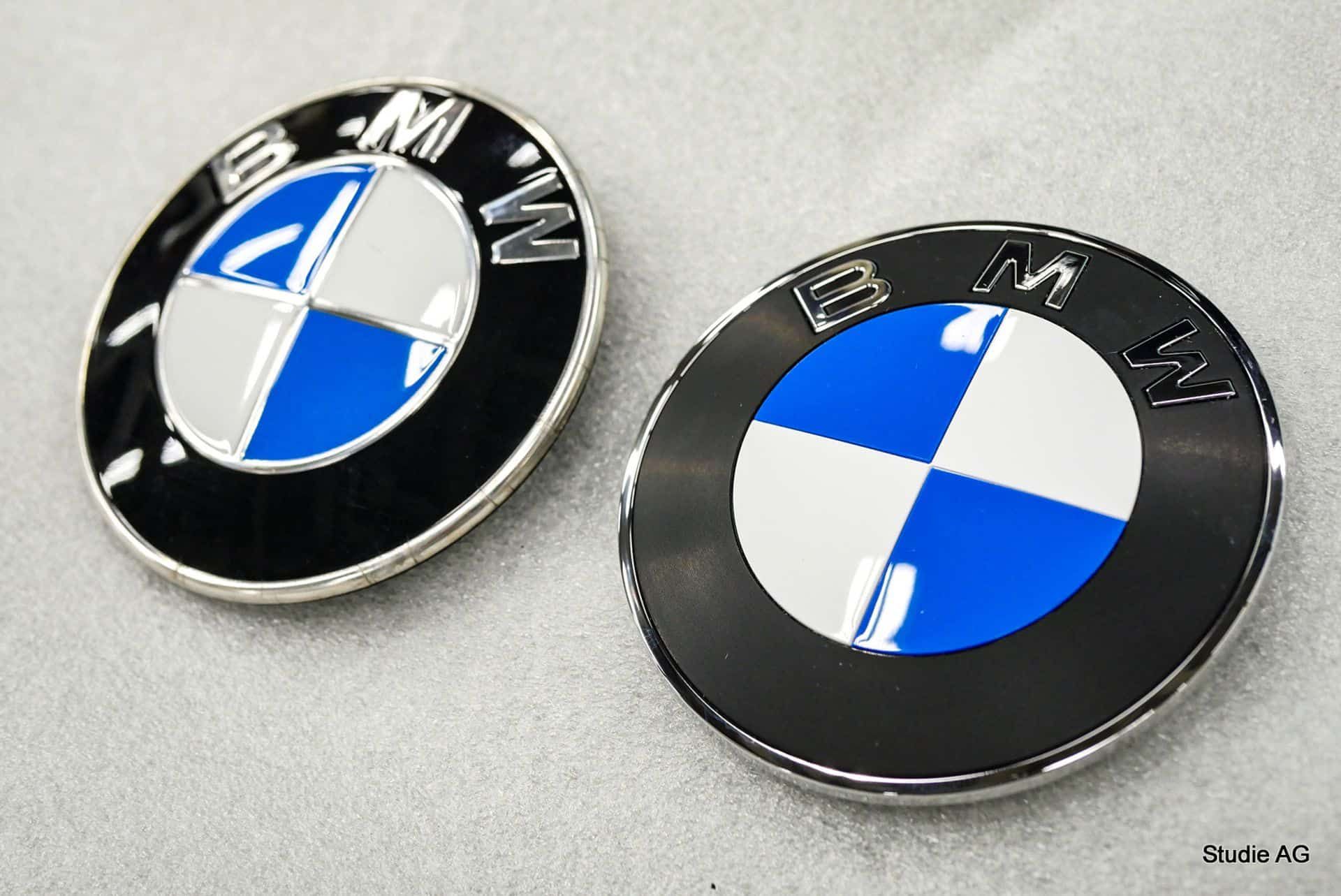
New images have surfaced showcasing BMW’s recently unveiled logo on the iX3, igniting a lively debate among automotive enthusiasts. Initially introduced a few months ago with minimal fanfare, the logo features notable tweaks rather than a complete redesign.
The updated roundel embraces a more minimalist aesthetic, reflecting current design trends while retaining essential elements. Chrome accents have been eliminated from the inner circle and the Bavarian flag, yet remain around the outer rim. This shift towards a matte black perimeter lends to a contemporary appearance alongside the slight reduction of chrome detailing, aligning with the broader industry movement towards flat designs.
Responses to the new logo have varied widely; some BMW aficionados express indifference, while others voice strong objections. One Reddit user noted the appeal of the original double chrome symmetry, suggesting both logos have their merits despite the subtlety of change. Conversely, some critics argue that altering the logo undermines BMW’s rich heritage, with comments referencing other luxury brands like Mercedes-Benz, which have maintained their emblems for over a century.
As brands evolve to remain relevant in a rapidly changing market, managing the redesign of established symbols can be challenging. Incremental updates may offer a balance, modernizing the brand without alienating long-time supporters—a strategy that stands in stark contrast to Jaguar’s more radical rebranding efforts.
Key Points:
– New BMW logo features minimalistic updates.
– Chrome accents reduced, adopting a matte black perimeter.
– Mixed reactions from fans highlight tension between tradition and modernity.
– Balancing brand evolution with heritage remains a design challenge.


