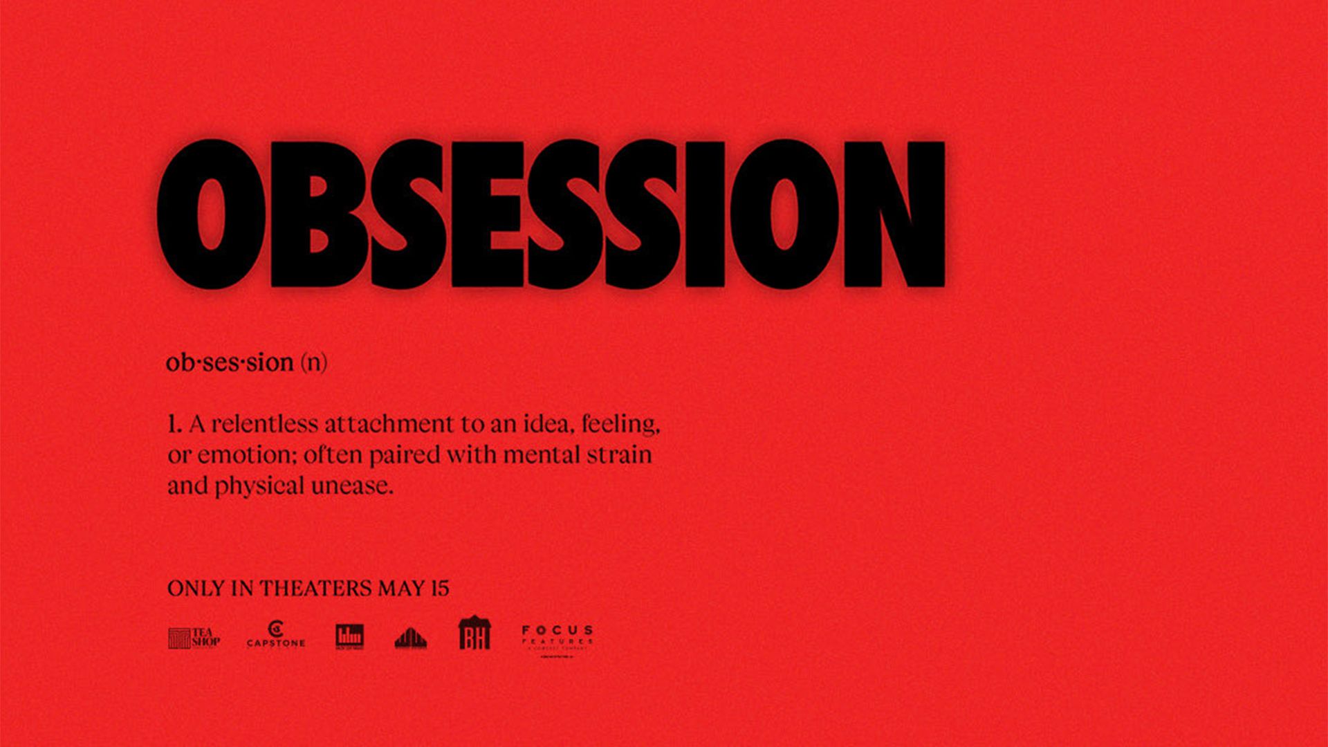
A new promotional poster for the upcoming horror film “Obsession” has sparked a heated debate among movie enthusiasts. Minimalist in style, the poster has received mixed reviews, with some praising its subtly eerie aesthetic, while others criticize it as uninspired and simplistic.
The poster employs a traditional horror color scheme of red and black, prominently featuring a concise definition of the film’s title in a sleek serif typeface. The bold sans serif title contrasts sharply with the minimalist text, utilizing abundant negative space to evoke feelings of discomfort.
Key viewer reactions include:
– Some fans described the design as “simple yet interesting,” appreciating its unsettling nature.
– Critics voiced their dissent, with one user lamenting, “It’s time to try different colors; red and black have lost their punch.”
– Another commented that the overall design “Feels like a Nike ad,” suggesting a disconnect from typical horror motifs.
While the minimalism used in the “Obsession” poster aims to create an unnerving atmosphere, many feel it leans too heavily on familiar tropes. This has raised questions about the creativity currently prevalent in the horror genre, indicating a potential need for fresh ideas in future film marketing campaigns. As the film industry evolves, it remains to be seen if filmmakers will respond to this demand for innovation in visual storytelling.