Instagram’s Recent Navigation Overhaul Sparks User Discontent
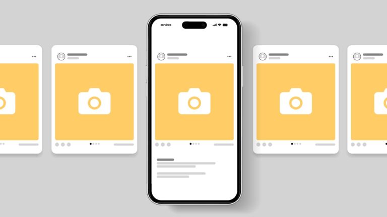
Instagram has unveiled significant changes to its navigation interface for the first time since 2022, igniting an array of user concerns about the platform’s shifting focus. The new design features revamped navigation buttons, as showcased in an explanatory video shared by Adam Mosseri, the platform’s head. However, responses from users indicate a growing frustration over Instagram’s apparent pivot towards a model more akin to TikTok, prioritizing viral video content over personalized feeds from users’ chosen followers.
Key User Concerns:
-
Shift Towards Viral Content: Many users expressed anxiety that Instagram is mirroring TikTok’s algorithm-driven model, which emphasizes random viral videos instead of curated content. One verified user argued, "We want our personalized feeds—bring back classy Instagram!"
-
Posting Challenges: Critics also highlighted that the new navigation design complicates content creation, placing the "create" button in the upper left corner rather than centrally. As one user complained, "It’s now harder to post; they seem more interested in keeping us scrolling."
-
Engagement Issues: Small business owners voiced additional worries, emphasizing the need for improved engagement features, with one remarking, "We don’t care about buttons, give us more reach!"
This redesign seems to amplify an ongoing sentiment that Instagram is straying from its original essence as a community-driven platform. Users are calling for a return to a more diverse content experience, rather than a homogenized social media landscape that feels increasingly disconnected from its initial purpose.