Horror Movie Poster Design Faces Creative Challenges Amidst Trend Saturation
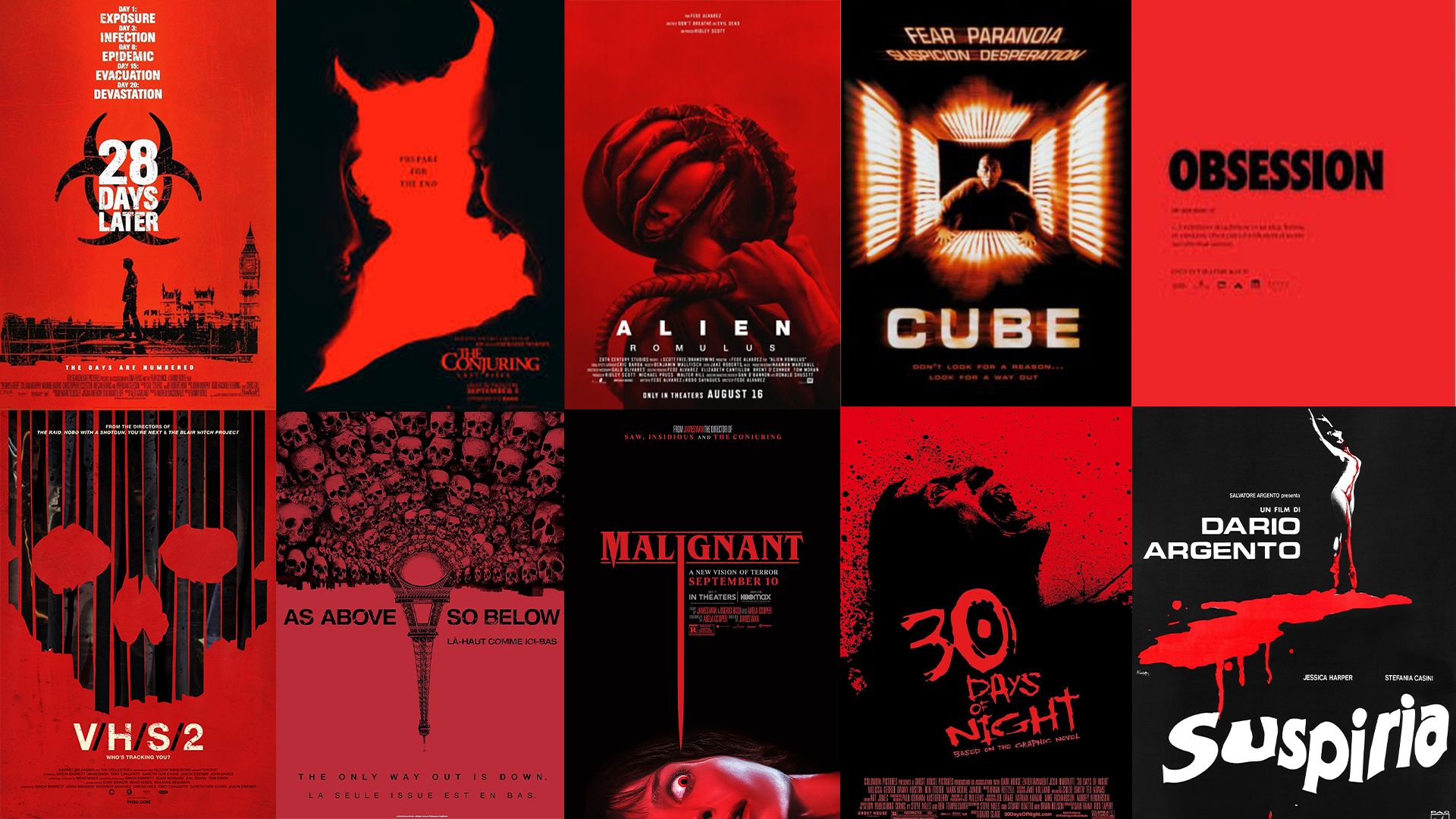
Horror movie posters are currently grappling with a distinct lack of originality, as they increasingly succumb to a formulaic design approach that leaves fans wanting more innovation. Characterized by repetitive motifs, a monochromatic red-and-black palette, and unoriginal typography, the genre’s promotional artwork has become alarmingly predictable. This design uniformity stifles creativity, reminiscent of vintage classics like Jaws and The Exorcist, which showcased rich artistic diversity.
Historical Context of Horror Posters
The evolution of horror movie poster design has traversed various styles since the genre’s inception. The journey began in 1896 with Georges Méliès’ Le Manoir du Diable, gaining prominence in the 1930s with Universal’s Classic Monsters. Each poster from this era showcased elaborate illustrations and bold colors, steering clear of minimalism and celebrating individualistic design.
By the late ’70s and early ’80s, horror aesthetics transitioned to more sophisticated themes, favoring minimalistic designs that evoked psychological suspense. Movies like Halloween and Suspiria adopted a stripped-back approach, using limited graphical elements to heighten intrigue. As the genre progressed into the ’90s, films like Cube and Misery maintained the minimalist trend, a pattern still observed in recent titles such as As Above So Below and Malignant.
Current Design Trends Stalling Innovation
Today, the trend of red-and-black horror posters remains prevalent, even affecting renowned franchises like Alien. While the color scheme effectively conveys horror themes—associating black with fear and red with danger—the overuse of these visuals leads to a lack of distinctiveness in new releases. The latest poster for Obsession is a stark example of this stagnation, revealing an exhausted design formula that does little to excite audiences.
Why This Trend Persists
Despite criticisms, the black-and-red poster design continues to have a psychological impact, effectively conveying a sense of dread through color symbolism. However, the technique’s efficacy diminishes when applied uniformly across multiple films. Viewers are yearning for more diverse and imaginative designs that break away from the monotony of conventional tropes.
The Call for Creative Innovation
While many horror posters have followed a predictable template, notable exceptions prove the value of innovative design. Works like the Mother and Frankenstein posters diverge from traditional aesthetics, offering unique visual experiences that resonate with audiences. This signals a clear opportunity for modern creators to embrace originality, catering to horror fans eager for a refreshing take on poster art that rejuvenates the genre. Moving beyond the stale black-and-red palette could redefine horror movie marketing, captivating both seasoned fans and newcomers alike.