HBO’s Logo Misalignment Sparks Debate: Key Insights Revealed
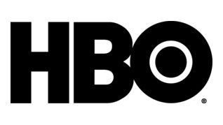
HBO, a network often entangled in controversy, has recently sparked discussions over its logo following its rebranding from HBO Max to simply Max. Attention has turned to its logo, where viewers have noted a subtle misalignment that raises eyebrows. Specifically, the ‘B’ appears slightly lower than the ‘H,’ and the ‘O’ is positioned higher than both, leading to a discussion about the logo’s design integrity.
According to logo designer James Barnard, initial observations suggested potential overshooting might explain the discrepancies. However, he later received insights from Gerard Huerta, the original designer of the HBO logo from the 1970s. Huerta shared the original design traced on tissue paper, revealing that the ‘H’ and ‘B’ were indeed aligned as intended. He pointed out that the issues arose during the digitization process, where minor deviations were introduced, impacting the logo’s overall symmetry.
In summary, while the HBO logo may appear flawed under scrutiny, its original design showcased a meticulous balance that has been lost in newer adaptations. This incident illustrates how branding can evolve—and sometimes, misrepresent its origins in the digital age.
Key Takeaways:
– HBO’s logo has become a topic of debate due to perceived misalignments.
– Designer James Barnard initially highlighted these issues, which were later clarified by the logo’s original creator, Gerard Huerta.
– Irregularities originated from the digital vectorization process, rather than an error in the original design.
– Such details, though subtle, can significantly impact brand perception in today’s visual landscape.

