Apple’s Design Principles Under Scrutiny: Are Changes in macOS Tahoe Causing User Discontent?
In a landscape where design expectations run high, Apple’s recent software update has sparked significant debate among users. The introduction of Liquid Glass across its product lineup has not only altered the aesthetic norms but also left some in the user community dissatisfied. While iOS 26 users have gradually accepted the visual shift, Mac users are voicing their frustrations, particularly regarding the updated menu icons.
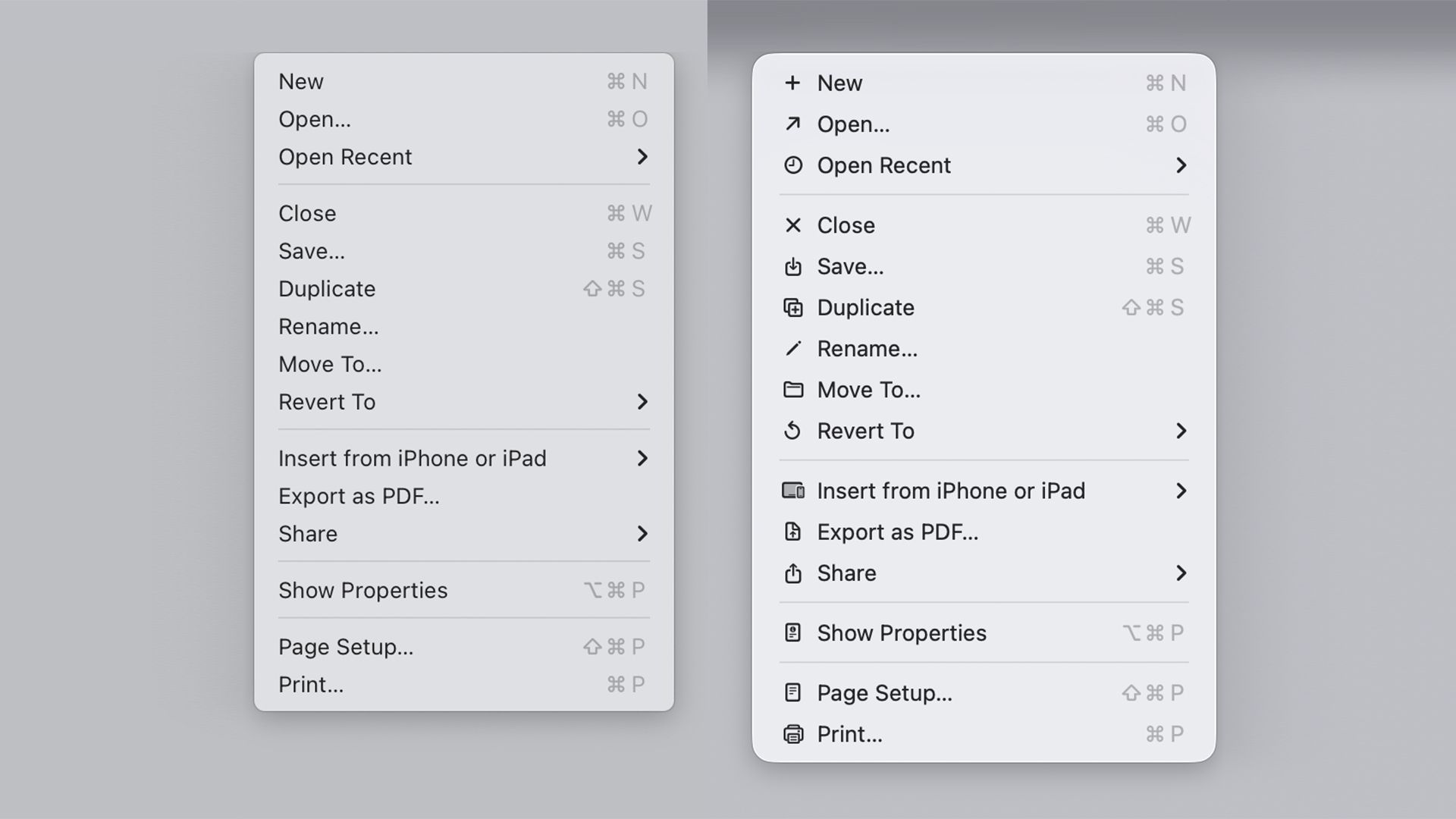
Designer Niki Tonsky’s in-depth analysis, titled “It’s Hard to Justify Tahoe Icons,” critiques the iconography of macOS Tahoe, labeling it as “unpleasant, distracting, and cluttered.” He references the 1992 Macintosh Human Interface Guidelines to illustrate how the new icons deviate from established design standards. Tonsky notes a worrying inconsistency, revealing over ten icons meant to represent a ‘New’ action across various applications, leading to confusion among users.
Further amplifying these concerns, web designer Jim Nielsen recently expressed his dissatisfaction, indicating that the menus in macOS Tahoe feel overwhelmingly busy. He echoes Tonsky’s sentiments regarding Apple’s apparent deviation from its own guidelines, particularly the advice against using arbitrary symbols in menus that could lead to visual chaos.
Tonsky’s critique gained traction on Reddit, where numerous users resonated with his observations. As one long-time Mac user noted, the interface’s current design has rendered their experience akin to that of a new computer user, sparking discussions on what this means for Apple’s commitment to its design principles.
As Apple navigates the balance between innovation and user experience, the ongoing dialogue among designers and users suggests that the conversation around the company’s decision-making is far from over.