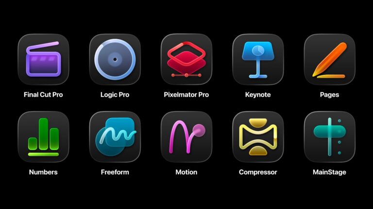
Apple’s recent redesign of its Font Book icon has sparked a wave of discontent among graphic designers, highlighting ongoing debates surrounding the company’s Liquid Glass design philosophy. This shift marks a notable evolution in Apple’s user interface, reminiscent of the transition from skeuomorphic to flat design seen in iOS 7 back in 2013.
The updated Font Book icon presents a stark simplification from its predecessor, which featured multiple typefaces depicting the letter ‘A’. The new icon replaces this with a sole, minimalist sans-serif character, raising questions about its functionality. Designers voiced their frustration on platforms like Reddit, with one remarking, “I get the modern take, but this is disappointing; I’d rather have it say ‘Aa’ than just ‘a’.”
Despite the outcry, some users appreciate the aesthetic appeal of the cleaner design. One commenter noted, “While the old app communicated its purpose better, I find the new one much prettier.”
The controversy underscores a broader concern over Apple’s design direction, as critics argue that the company is drifting away from its vibrant and playful design roots. The debate exemplifies the tension between minimalism and functional clarity within modern design principles, raising the question: Has Apple strayed too far from its colorful legacy in pursuit of a sleek new look?
Key points:
– Apple’s Font Book icon has been simplified to a single sans-serif character.
– Designers express concerns over functionality and clarity.
– Opinions are mixed, with some praising the aesthetic appeal of the new design.
– The redesign is part of Apple’s broader Liquid Glass design philosophy, stirring debate about artistic direction.


