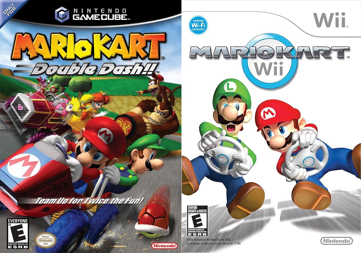
Gamers are currently embroiled in a passionate debate surrounding the logo design of the iconic Mario Kart franchise. The discussion ignited on Reddit, where users expressed their dissatisfaction about a logo change implemented over two decades ago, prompting many to revisit their strong feelings about the design shift.
Prior to the release of Mario Kart: Double Dash in 2003, the game’s logo featured a playful and colorful typeface that resonated with the whimsical nature of the Mushroom Kingdom. However, starting with Mario Kart DS in 2025, the series adopted a more contemporary and sleek design. This new logo boasts a racing-inspired font, complete with smooth lines and a chrome finish, which some players believe diminishes the franchise’s original charm.
One user lamented, "Twenty years later and it still bothers me just how much of a huge downgrade this logo change was," while others echoed similar sentiments, emphasizing the joy and whimsy reflected in the earlier logo. However, a segment of gamers has risen in favor of the updated design, arguing that it aligns better with modern racing aesthetics. One supporter stated, "I much prefer the newer logo. It’s slicker and reflects what you would expect from a racing game."
This ongoing debate illustrates the emotional connection gamers have with the franchise and highlights the broader conversation about branding in the gaming industry. Whether nostalgic for the past or embracing the present, opinions remain divided on the significance of logo design within a beloved gaming series.

