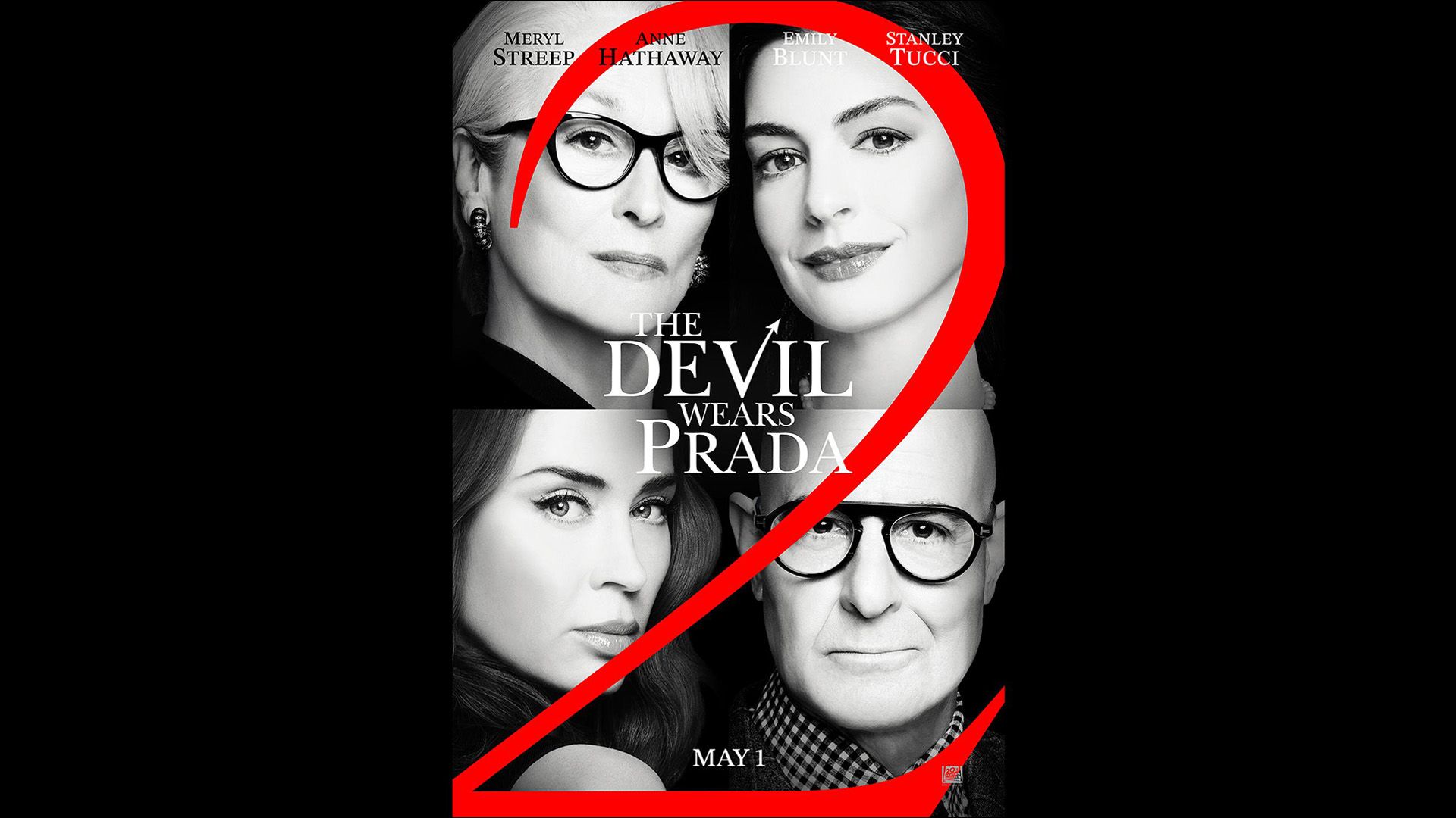
New promotional materials for The Devil Wears Prada 2 have recently arrived, provoking a range of reactions among fans and critics alike. The latest poster, touted for its simplicity, has drawn scrutiny for its lackluster design, which some have compared to amateur fan art. With a predominantly monochrome palette and minimal flair, this poster appears to miss the mark on what makes effective movie marketing.
Fans have expressed confusion over the artistic choices, particularly the use of plain black and white headshots of lead actors Meryl Streep, Anne Hathaway, Emily Blunt, and Stanley Tucci, all overshadowed by a prominent ‘2’ emblazoned across the design. Critics argue that the airbrushed images detract from the dynamic personalities of the cast, resulting in a somewhat flat representation.
Typography has also been a contentious point, as certain text elements blend into the visuals, rendering them difficult to read. This approach, it seems, muddles the overall aesthetic and fails to capture the original film’s bold visual identity. "The striking red heel with a devil trident in the original poster was iconic," remarked one fan, lamenting the stark contrast with the current offering. "This has the creativity of Microsoft Paint," they added, reflecting a broader sentiment among viewers who expected a more sophisticated look.
Despite the dated charm of the original promotional content, the new artwork’s sparse style appears to lack the luxury and elegance associated with the Devil Wears Prada brand, leaving some fans feeling disheartened. As anticipation for the sequel grows, many are left wondering if this design choice represents a misstep in capturing the film’s essence.