Major Brands with Remarkably Similar Logos Ignite Discussion on Originality
In the competitive realm of branding, originality stands as a paramount objective, yet some logos spark confusion due to their striking similarities. This phenomenon often raises eyebrows, compelling audiences to question the creative choices behind brand identities. While there are instances where brands intentionally design similar logos to evoke associations with more established companies, many cases arise from coincidental similarities or shared industry conventions.
Understanding the nuances behind these similarities can shed light on broader design trends and practices across different sectors. From legal disputes to unintended resemblances, the following highlights ten major brands that feature logos which bear a remarkable likeness.
Key Examples of Similar Logos:
-
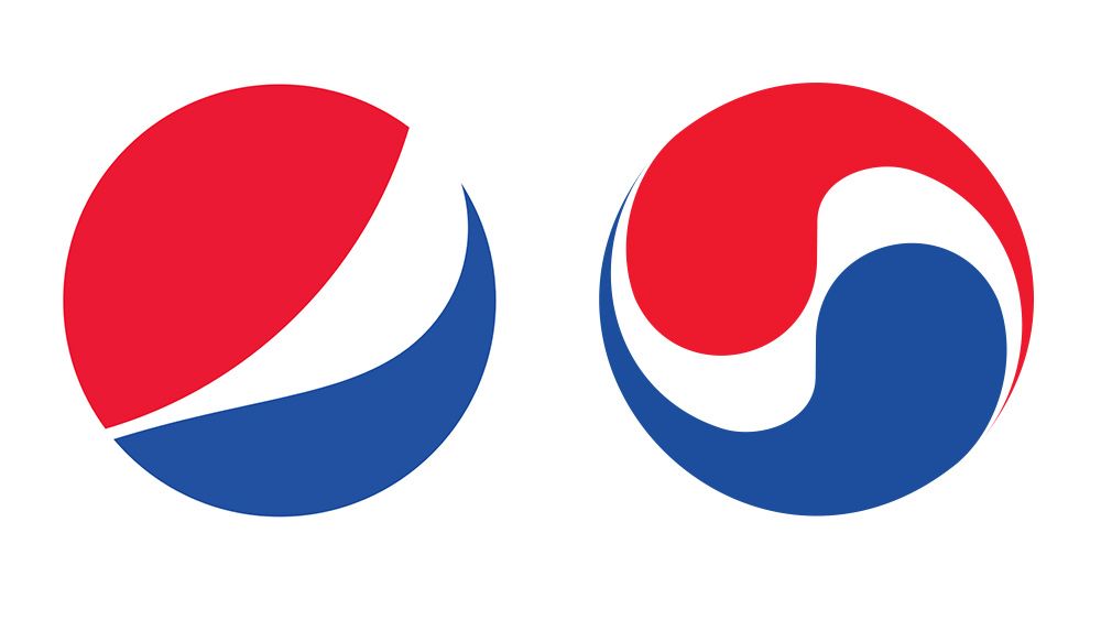
Pepsi vs. Korean Air: Both brands utilize colors inspired by their national flags. Although they exhibit strong resemblance, the similarity emerged accidentally due to shared visual elements.
-
Formula 1 vs. 3M’s Futuro Tights: A legal dispute occurred when 3M claimed that Formula 1’s logo resembled their own. The companies eventually reached an agreement, illustrating the complexities of logo design in overlapping sectors.
-
Airbnb vs. Azuma Drive-In: Airbnb’s Bélo symbol drew comparisons to the Azuma logo from 1975, prompting discussions on originality versus coincidence in design.
-
Starbucks vs. Starpreya: An intriguing David-versus-Goliath scenario unfolded when Starbucks faced off against the South Korean coffee company. Despite similarities, the court ruled that the logos were too distinct to confuse consumers.
-
Ubuntu vs. Human Rights Foundation: Both organizations feature a circle of figures holding hands, yet serve vastly different purposes, showcasing how universal visual metaphors can overlap across industries.
-
Gucci vs. Chanel: High-fashion brands Gucci and Chanel employ geometric monograms that, while similar, maintain subtle differences, demonstrating that even the most renowned brands encounter overlaps in design.
-
Beats by Dre vs. Stadt Brühl: The lowercase ‘b’ logo of Beats closely resembles an earlier design associated with Stadt Brühl, illustrating how monogram logos can lead to unintentional likenesses.
-
Sun Microsystems vs. Columbia Sportswear: The unique ambigram design of the Sun Microsystems logo contrasts with Columbia’s similar structure, revealing how inventive elements can distinguish one logo from another.
-
PayPal vs. Pandora: Legal challenges emerged when Pandora’s logo closely mirrored PayPal’s, highlighting the risks associated with using single-letter icons in branding.
These examples fuel a larger conversation about the challenges and ethics of logo design. Whether driven by inspiration, coincidence, or the need for legal clarity, the landscape of branding continues to evolve as companies navigate the delicate balance between similarity and originality.