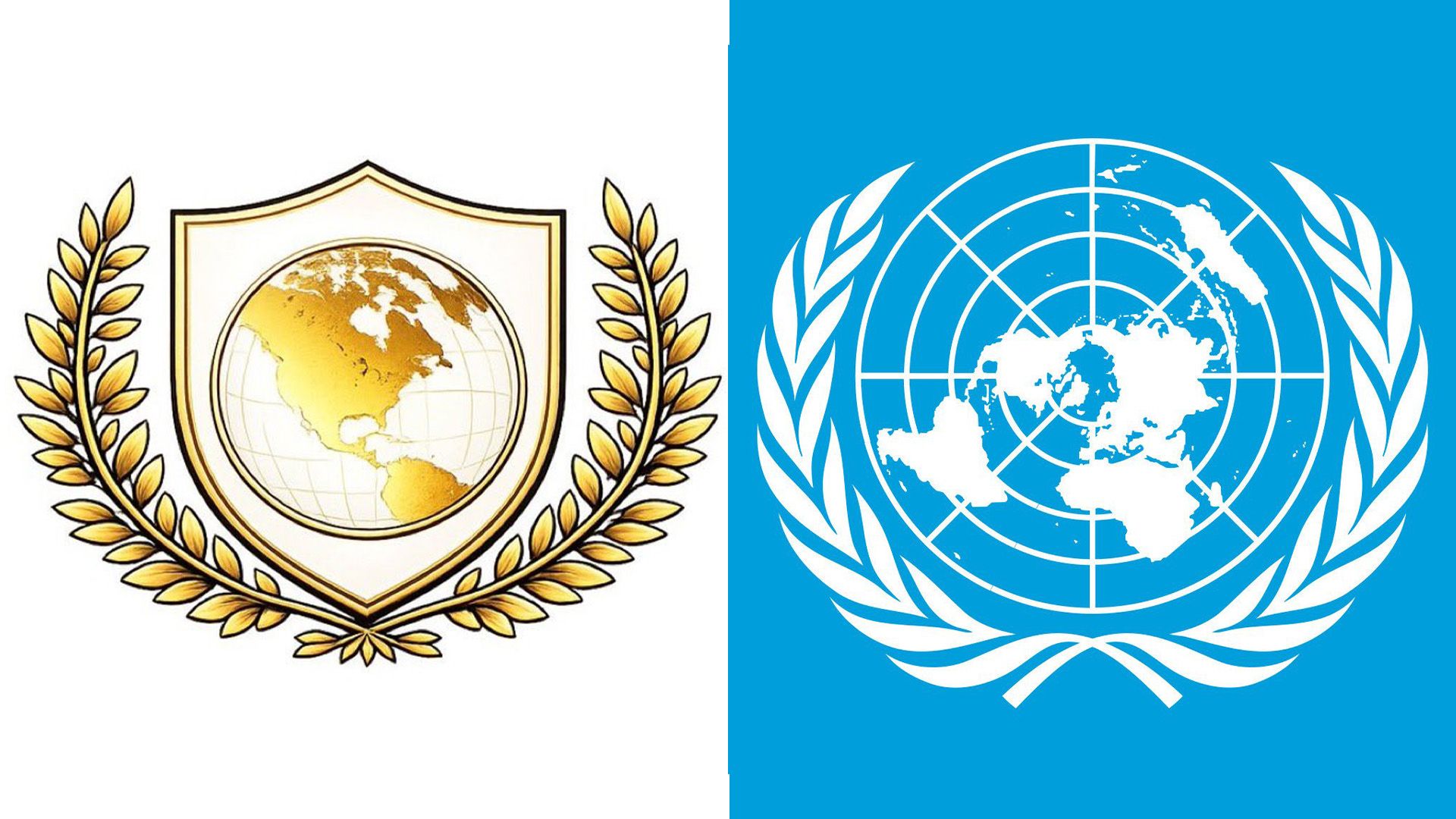
Donald Trump has recently unveiled a new initiative called the "Board of Peace," accompanied by a striking logo that is primarily gold in color. This announcement was made at the World Economic Forum in Davos, where Trump stated that the newly formed board aims to address global conflicts. However, reactions on social media have drawn immediate comparisons to the United Nations emblem.
The logo of the Board of Peace closely resembles that of the UN, which features a wreath of olive branches embracing a world map. The notable difference is that the Board of Peace’s design focuses solely on North America, depicted in a flashy gold tone. This artistic choice has sparked online commentary, with many users describing the logo as a gaudy reinterpretation of the UN’s original emblem.
Key Comparisons and Public Reactions:
- Visual Similarity: Critics point out that the Board of Peace logo is essentially a gold-plated version of the UN logo, with a significant reduction in geographical scope.
- Public Sentiment: Social media has reacted with humor and skepticism, suggesting that the design appears as if it were conceived by a high school art class.
- UN Logo Origin: The original UN logo, designed in 1945 under the leadership of Oliver Lincoln Lundquist, aimed to portray a global vision encompassing multiple continents.
As the Board of Peace continues to draw attention, many are questioning the intent and implications of its design in relation to international diplomacy. While the official rationale behind the logo has yet to be disclosed, observers are left to ponder whether this branding signifies a genuine alternative to existing global governance institutions like the UN.

