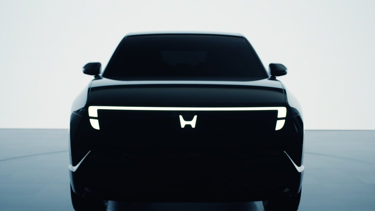
Honda Unveils Retro-Inspired Logo Ahead of EV Launches
Honda has introduced a refreshed logo, marking a significant aesthetic shift as the automaker prepares for its upcoming electric vehicle (EV) lineup. This new iteration of the iconic ‘H’ symbol is set to appear on models slated for launch in 2027 and beyond.
Previously unveiled at CES 2024, the revised logo reflects a broader industry trend away from intricate, metallic designs toward simpler, flatter visuals. The redesign aligns with Honda’s commitment to next-generation EVs, including the anticipated Honda 0 Series. According to a company press release, the new logo signifies Honda’s dedication to innovation and its core philosophy of pushing boundaries in the automotive realm.
Key features of the new logo include:
– A simpler, modernized appearance that harks back to Honda’s original branding from 1961.
– A representation of two outstretched hands, symbolizing the company’s intention to enhance mobility and address customer needs.
– A strategic shift that signals Honda’s ongoing evolution as it embraces the future of electric vehicles.
As nostalgia drives a resurgence of classic logo designs across the automotive industry, it raises questions about the balance between modernity and tradition. With the new logo, Honda aims to honor its heritage while confidently stepping into a more sustainable future.


