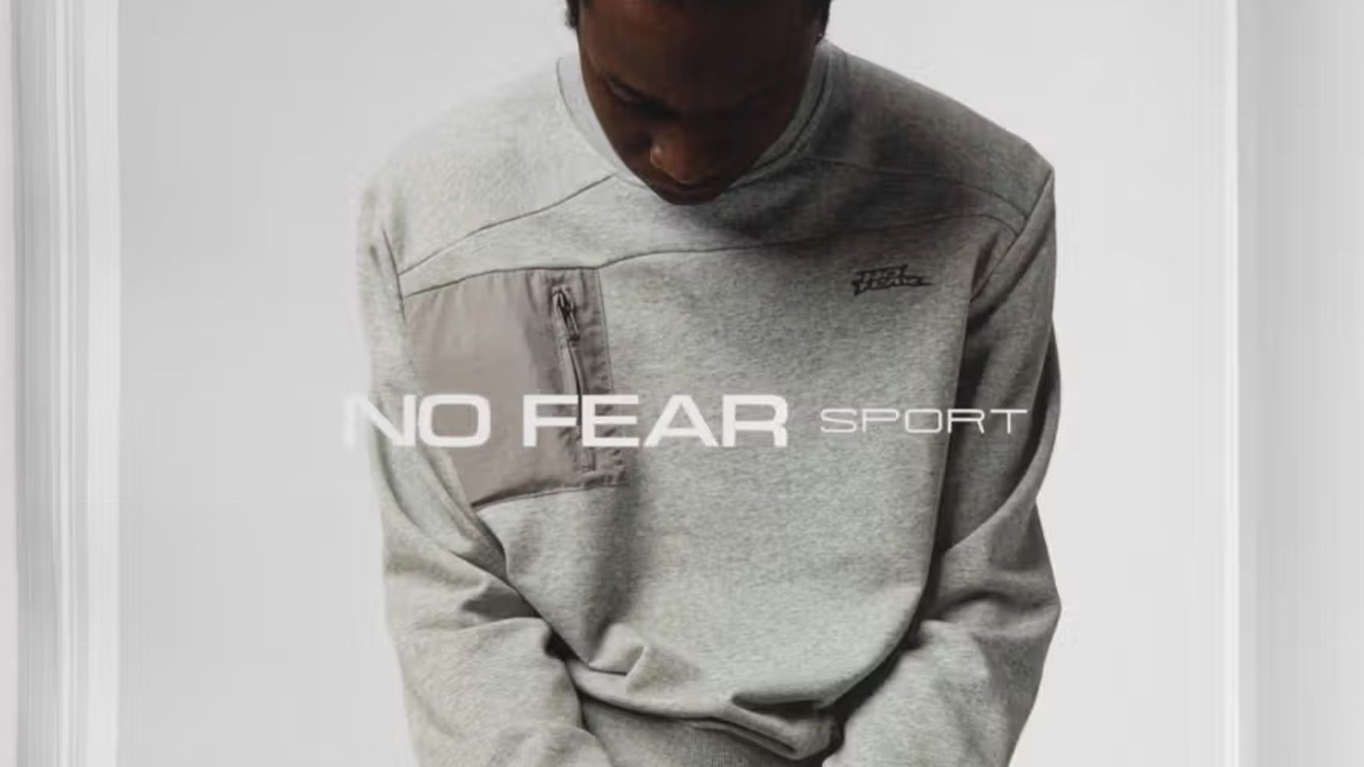
Clothing brand No Fear, once a hallmark of 90s and early 2000s youth culture, is attempting a revival with its new offshoot, NO FEAR SPORT. Once celebrated for their edgy designs that resonated with millennial counter-culture, the brand has shifted towards a more minimalist approach, appealing to Gen Z sensibilities. The new collection, characterized by its “focused core basics,” features neutral tones and understated logo designs, distinguishing itself from the vibrant, rebellious spirit that originally defined No Fear.
The latest campaign employs a clean, fashion-catalog aesthetic, showcasing simple backgrounds and moody model imagery. In stark contrast to the bold graffiti-style fonts of its past, the refreshed brand identity utilizes a modern sans-serif wordmark, creating a sleek look aimed at contemporary audiences.
While the clean design may be more palatable to today’s fashion trends, many fans of the original brand are left reminiscing about its audacious past. The nostalgic appeal of No Fear’s edgy graphics and memorable phrases continues to resonate with those who grew up during its heyday. Although the brand has made strides to adapt to current style preferences, its legacy as a symbol of a more vibrant, playful era of fashion remains unparalleled.
In summary, while No Fear’s transition to NO FEAR SPORT may attract a new generation of consumers, it also raises questions about the essence of fashion branding. Will this minimalist approach connect with audiences as deeply as the chaotic, expressive style of the past? Only time will tell if this new chapter will carve out its own unique space in the fashion landscape.


