America’s Best Launches Playful New Logo to Enhance Brand Identity
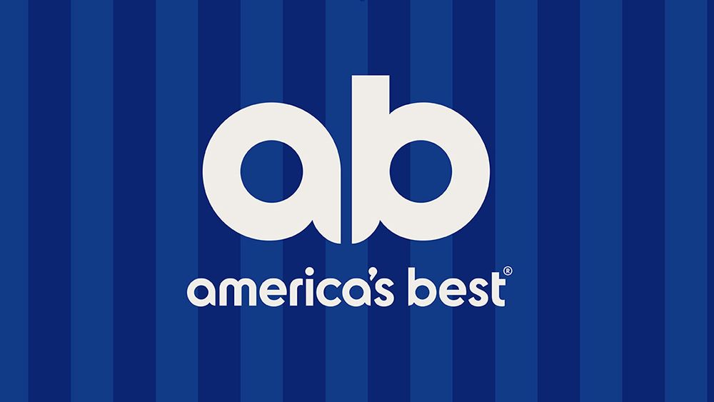
America’s Best, a leading provider of affordable eyecare and eyewear, has unveiled a striking new logo that aims to redefine its brand identity. The updated design cleverly incorporates the initials “AB” to depict an owl’s face, paying homage to the brand’s long-standing mascot and its notable visual acuity. This rebranding marks a significant shift from the previous logo, which featured a more traditional and generic US flag design that lacked clear representation of the brand’s services.
A Fresh Look with a Nod to Heritage
Owned by National Vision, America’s Best operates approximately 1,000 stores nationwide. The old logo, often deemed outdated, didn’t effectively convey the brand’s mission. The new design emphasizes simplicity and personality, making the brand more accessible across various platforms. The previous 3D owl mascot has also been revitalized into a flatter, more versatile design while maintaining a strong connection to the brand’s roots.
Modernized Color Palette and Visual Elements
The new logo retains the traditional US colors of red and blue, but introduces modern, vibrant shades to refresh the visual appeal. Additionally, stripes reminiscent of the US flag have been incorporated into the brand’s aesthetics.
Enhanced Customer Engagement and Messaging
The rebranding initiative, executed by VML, also encompasses a comprehensive overhaul of America’s Best’s social media presence and website, featuring photography and videos that capture the daily experiences of its customers. A new tagline, “Every Eye Deserves Better,” reinforces the brand’s commitment to quality, accessible eyecare for all.
Tom Murphy, Chief Creative Officer at VML US, stated that the goal was to invite consumers to appreciate the myriad ways their vision enhances their lives. This innovative approach to rebranding illustrates how a company can modernize its identity while honoring its legacy.

